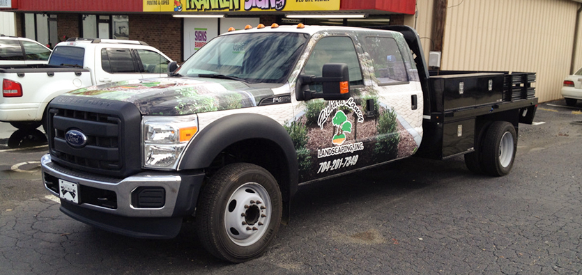
While traveling around the city, you must have come across many vehicle wraps. Some vehicle wraps might be appealing whereas some might make you question the aesthetic sense of the designer as well as the vehicle owner.
There are certain elements of a vehicle wrap that makes them appealing and intriguing. Wraps that are designed properly convey the message they are supposed to, while others just act as a deterrent. You might see a vehicle parked on a busy road in a parking lot that suddenly grabs your attention. You will notice that it uses pretty and vibrant colors and the text is legible and not too big or too small.
On the other hand, vehicle wraps with dull and gloomy colors, background with a smaller print that is hard to read and unappealing patterns are neither appealing nor do they convey the message that you would like them to.
A bad vehicle wrap design detracts customers from the message and decreases its impact, hence make sure that you always get your vehicle wrapped by a certified sign company.
Also Read: Why Is A Wrap Important For Your Business Van?
If you are planning to get vehicle wraps designed for your business but don’t know what makes a vehicle wrap design good or bad then keep on reading. In this blog post, we will outline some common vehicle wrap design mistakes that you should avoid.
The Vehicle Wrap Design Is Too Busy
Sometimes when you are working with larger canvas like a cargo van wrap or large truck wrap, it becomes quite tempting to throw lots of offers and extra information into your design.
But this is a bad idea, vehicle wraps need to be simple so that they are easy to read while speeding down the highway or when they are parked in front of a job site. Now the question arises how do you keep your vehicle wrap design from getting too crowded?
The best way to keep your vehicle wrap design as simple as possible is by asking yourself if everything included in the design is really important.
A simple vehicle wrap design doesn’t need much more than the contact information, business name, and key services. Also, make sure that there are areas of white space on your vehicle’s wrap as it will make everything much easier to read.
But the best way to avoid this common design mistake is by getting your vehicle wrap designed and made by a certified sign company.
Avoid Cool Typography
Sometimes you might find a really cool new font and you want to share it with the world but before you inculcate that font in your vehicle design you first need to make sure that is it legible from a distance.
The big sans serif font is not the fanciest font but it is one of the most legible fonts. If your vehicle wrap is not readable from a distance then it can’t be effective. Hence make sure you choose a font that is legible from a distance. The best way to find out if your vehicle wrap design is legible or not is by asking a friend to take a look at the design from a distance.
Also, make sure to ask your sign company to not use fancy typography while making the design of your vehicle wrap as it makes it hard to read.
The Vehicle Wrap Doesn’t Fit The Car
The misaligned graphics and seam might seem like an installation problem but most of the time-poor vehicle wrap design fit is traced back to the designer.
But how can you make sure that your vehicle wrap design will look as good on your vehicle as it looks on the computer screen?
The best way to make sure that your vehicle wrap design perfectly fits your vehicle is by hiring a certified sign company, as the professionals will make the best vehicle wrap that will perfectly fit your vehicle.
About A Sign Promotion
A Sign Promotion provides you with the best window graphics, whether you are looking for perforated graphics, privacy graphics, or simply informative graphics. We put effort into our process to make our designs fulfill all your needs while being aesthetically pleasing.
Contact Us now to get window graphics customized for your business to actively enhance your business’s customer attraction and profitability.


